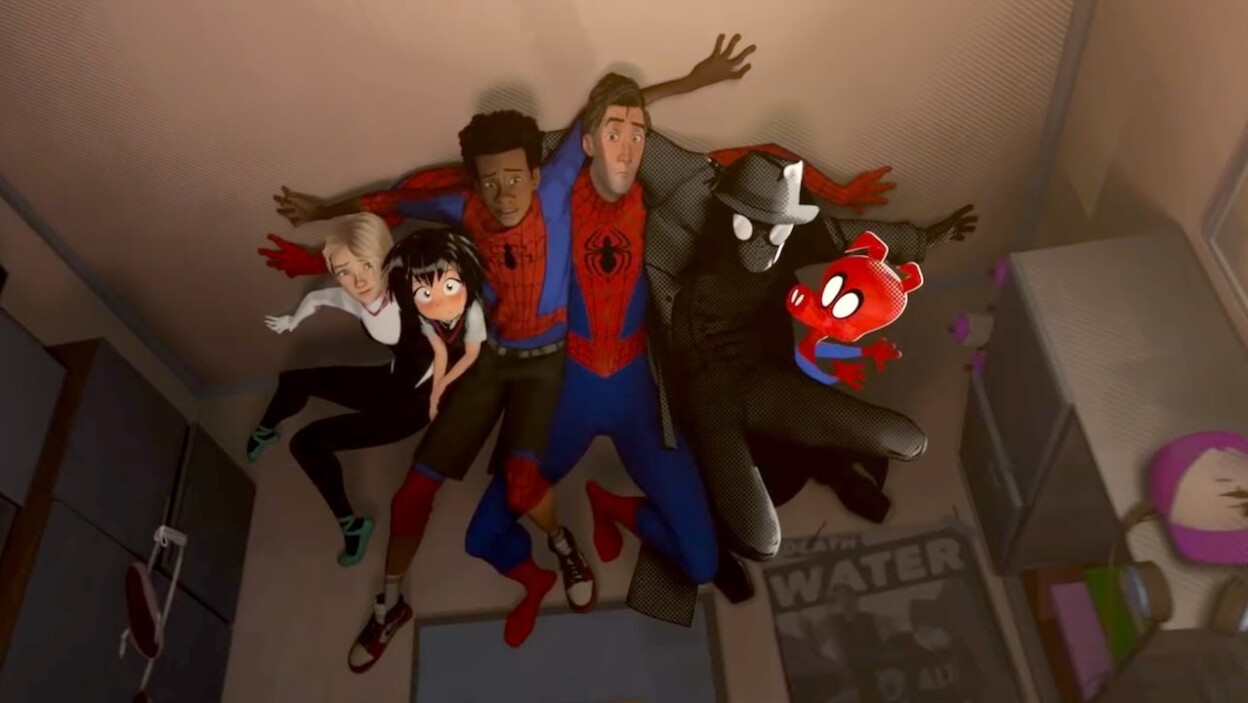
Spider-Man: Into the Spider-Verse was a damn good animated film and quite possibly the best Spider-Man film since Sam Raimi’s Spider-Man 2. Along with its amazing characters and humor, the film had plenty to offer in the visual department providing a feast for the eyes. Yeah, the animation was top-notch and the film is probably going to take home the Oscar for Best Animated Film like as its been doing so for plenty of other award shows.
The animation is no doubt great and there was definitely a lot of work put into it before we saw it on screen but these early storyboards and animatics for the film look pretty cool themselves. Alberto Mielgo, who was hired to direct the film’s animation test, has shared the original Into the Spider-Verse storyboards and animatics on Vimeo and there are some pretty cool things there, things that we recognized and some things that we probably don’t. Check it out below:
https://vimeo.com/311716775
Damn! That honestly looks good and I’m kinda inspired now but hell, of course there were some changes including the death of Peter Parker which saw him getting his body blasted by Kingpin’s beam in a way that’s too gruesome to be in a kid-friendly animated film. Like, that shit was intense, like you see his skull and s–t but yeah, that wasn’t in the final film but a lot of the stuff were.
It’s amazing to see what animation can do and hell, maybe we’ll get something that gruesome in the future… but it’ll probably be Rated-R. Actually, a Rated-R Into the Spider-Verse spin-off could work.
Source: Vimeo

